Which Color Profiles Should You Use in Procreate?
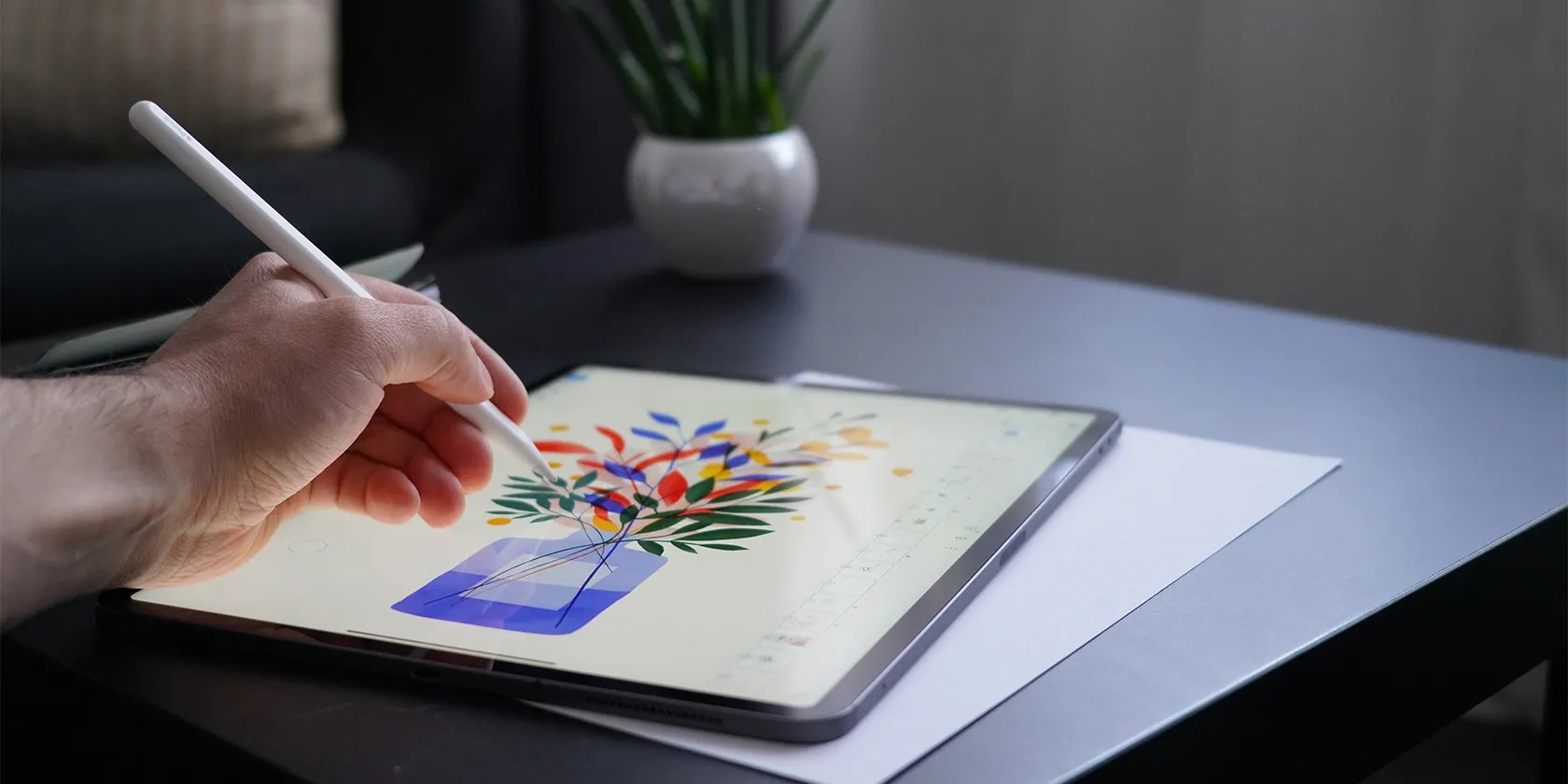
Imageby Sorin Gheorghita via Unsplash. No attribution required.
Color profiles are often known by professional designers, but if you’re a hobby artist or haven’t had training, then CMYK, RGB, and all the options may seem like gibberish. Procreate uses standard color profiles, as well as some more specialized options. If you’ve wondered what all the letters mean when you make a new Procreate canvas, you’ll soon have answers as we’ve explained the differences and when to use which color profiles in Procreate.

What Are Color Profiles?
If you’re an experienced graphic designer or digital illustrator, you may already know all about color profiles. But if you’re self-taught, a hobbyist, or brand new to digital art, you might be wondering what the acronyms are.
There are many different color profiles, and they differ for different parts of the globe, but for the most part, color profiles are split into two categories: Print and Screen.

Print color profiles are spectrums of color that work best for printed artwork, packaging design, or anything that will be physically produced. The general name for print color profiles is CMYK. This stands for Cyan, Magenta, Yellow, and Black (known as Key in the industry). If you’ve ever changed your inkjet printer’s cartridges, you’ve likely used these four colors for the ink. Printers only need CMYK colors to reproduce all other colors.
Screen-based color profiles are usually known under the RGB acronym; this stands for Red Green Blue. These three colors are what make up any color you see on a screen—your computer, phone, tablet, and even televisions or digital billboards. RGB uses light to create colors, which is why RGB is used for screen-only designs.

You canuse Procreate to create a color palettein many different ways. Once you’ve got the right color profile, your colors will work harmoniously together.
What Are Procreate’s Color Profile Options?
To see all the color profiles available in Procreate, open your ProcreateGalleryand tap+to start a new canvas. Although many profiles are listed that you can choose from or customize, to see the default profiles tap theNew Canvasicon and thenColor Profile. There are two options here: RGB and CMYK.
After setting your color profile, add suitable colors to your Procreate art. There are manydifferent ways to color your artwork in Procreate, and it doesn’t matter which color profile you’re on. However, CMYK colors appear less saturated on screen compared to RGB colors.

1. Procreate RGB Profiles
Depending on which Procreate version you’re running, and on which iOS, there are at least five profiles under Procreate’s RGB options: Display P3; sRGB IEC61966-2.1; sRGB v4 ICC Appearance; sRGB v4 ICC Preference; sRGB v4 ICC Preference Display Class.
Display P3 is an Apple-made screen profile. Display P3 provides a 25% larger color space than other sRGB profiles, which results in more saturated colors in your display.

The other sRGB—Standard Red Green Blue—profiles offer similar color spectrums to one another. If you’re sharing your digital art with other computers or digital software, it’s best to calibrate the color profiles—so it’s the same no matter where you’re accessing your art.
2. Procreate CMYK Profiles
There are around 11 profiles for CMYK on Procreate. Similarly to the RGB profiles, you should calibrate your CMYK profile to the printer you plan to use; this is integral if you’re sending your artwork for commercial printing or international printers.
International printers often use different printing profiles, especially between North America, Europe, and Asia—Japan, more specifically. European printers most often use FOGRA, although there’s still at least three FOGRA choices.
If you are planning to print your artwork commercially, it is best to contact the printer beforehand to check which color profile will work best. If you’re printing at home, either calibrate your home printer or just use Generic CMYK Profile.
When to Use Different Color Profiles in Procreate
As you’ve learned throughout this article, if you’re printing your artwork, you should use CMYK. And if you’re keeping the artwork digital, it should be RGB.
In some other software, it is possible to change the color profile midway through the artwork creation. For Procreate, unfortunately, you cannot switch between RGB and CYMK profiles after the canvas has been set up. This means If you create your art canvas in the wrong profile, you can’t change it back.
you may, however, change color profiles within the RGB and CMYK spheres if required. This is helpful if you’re sending your artwork to print in different continents or find different screen profiles to display your work on.
If you know your artwork will be printed as well as displayed on screen, it is best to design or draw in RGB. CMYK profiles are digitally replicated anyway, since it’s an app software and cannot be truly CMYK by design.
While there are many third-party software that can help you convert your artwork from CMYK to RGB or vice versa, using Adobe Illustrator is a top choice. it’s possible to alsouse Adobe Illustrator to vectorize your Procreate illustrations.
Always Use the Correct Color Profiles
Unless you’re a trained illustrator or designer, you might not know the differences between color profiles in digital art software. Procreate offers over 15 color profiles, but now you’re a little more aware of what they each mean.
For most hobbyist Procreate artists, the generic profiles will suit you just fine. It’s best if you don’t make the mistakes of choosing a CMYK profile instead of an RGB one, but it’s an easy fix if you move outside the app.
Follow these troubleshooting tips to fix any problems with your Apple Pencil and Procreate.
It’s not super flashy, but it can help to keep your computer up and running.
Goodbye sending links via other apps.
If an AI can roast you, it can also prep you for emergencies.
Tor spoiled me forever.
My iPhone does it all, but I still need my dumb phone.